Chattanooga Has Its Own Font: Why Do They Need It and How Did It Happen?

Chattanooga, Tenn., recently became the first American city to have its own typeface. The typeface project was started by a group of local designers — Jeremy Dooley and Robbie de Villiers, with help from D.J. Trischler and Jonathan Mansfield — and funded by a Kickstarter campaign. They raised more than $11,000 to fund the font, which is available for free on the designers’ website.
Why does a city need its own typeface? According to the Kickstarter page, the designers are looking to help Chattanooga establish a brand:
We want Chattanooga to be the poster child for municipal branding in America. Many European cities commission a custom typeface and use it to set themselves apart. If you've ever traveled abroad, you've noticed how signage in different regions seems to really pop - because it's unique and communicates something new on that route. In America, a similar movement is beginning. Chattanooga can spark the typographic revolution!
The creators envision the typeface being used on billboards, libraries, government websites and advertisements for local events. They believe that unifying the look and feel of typefaces in the city will help unite its people.
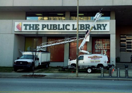
Credit: Chatype
Workers install a new sign, created with Chatype, at a public library in Chattanooga, Tenn.
The Atlantic Cities offers some additional background on the project:
Dooley, who runs Insigne Design and sells his various fonts online through MyFonts, told me that the initial idea was to approach the city government for funding. But after some meetings his group decided that attaining public money would be difficult, run counter to the spirit of the project, and would require a lot of time to get people on board.
"With Kickstarter, we bypassed the politics and bureaucracy and instead formed a grassroots effort through crowdfunding," he says. "It was only after our success and after multiple city organizations enthusiastically embraced the face that the city decided to name Chatype as its official typeface."
One of the influences for this project was Metro Letters: A Typeface for the Twin Cities initiative by the University of Minnesota Design Institute, an experiment to understand the relationship between typography and urban identity. Inspired by this well-publicized 2003 project, Dooley, who started up his office in Chattanooga in 2007, sought out de Villiers, who had moved into town around the same time, as collaborators: "Being new to the area, we didn't know what we could or couldn't do, so we took a shot at this new font concept."
Check out the video below to learn more about the project.